필터
filter: hue-rotate()
엘리먼트에 색조 회전 필터를 적용하는 유틸리티입니다.
| Class | Styles |
|---|---|
hue-rotate-<number> | filter: hue-rotate(<number>deg); |
-hue-rotate-<number> | filter: hue-rotate(calc(<number>deg * -1)); |
hue-rotate-(<custom-property>) | filter: hue-rotate(var(<custom-property>)); |
hue-rotate-[<value>] | filter: hue-rotate(<value>); |
예제
기본 예제
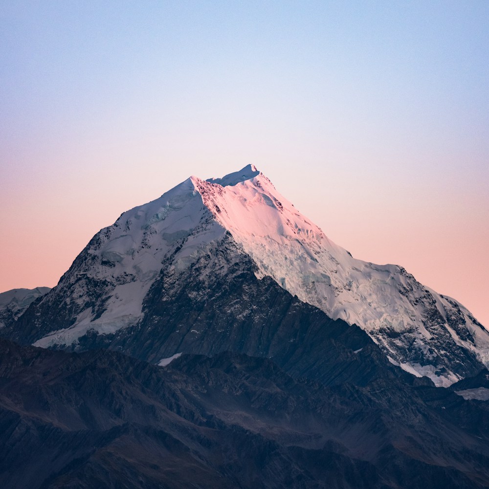
hue-rotate-90과 hue-rotate-180 같은 유틸리티를 사용해 엘리먼트의 색조를 각도별로 회전시킬 수 있습니다:
hue-rotate-15
hue-rotate-90
hue-rotate-180
hue-rotate-270
<img class="hue-rotate-15" src="/img/mountains.jpg" /><img class="hue-rotate-90" src="/img/mountains.jpg" /><img class="hue-rotate-180" src="/img/mountains.jpg" /><img class="hue-rotate-270" src="/img/mountains.jpg" />음수 값 사용하기
-hue-rotate-15와 -hue-rotate-45 같은 유틸리티를 사용해 음수 색조 회전 값을 설정할 수 있습니다:
-hue-rotate-15
-hue-rotate-45
-hue-rotate-90
<img class="-hue-rotate-15" src="/img/mountains.jpg" /><img class="-hue-rotate-45" src="/img/mountains.jpg" /><img class="-hue-rotate-90" src="/img/mountains.jpg" />커스텀 값 사용하기
hue-rotate-[<value>] 구문을 사용하세요 hue rotation를 완전히 커스텀한 값으로 설정하려면:
<img class="hue-rotate-[3.142rad] ..." src="/img/mountains.jpg" />CSS 변수를 사용하려면 hue-rotate-(<custom-property>) 구문을 사용할 수도 있습니다:
<img class="hue-rotate-(--my-hue-rotate) ..." src="/img/mountains.jpg" />이는 hue-rotate-[var(<custom-property>)] 의 단축 표현으로, 자동으로 var() 함수를 추가해 줍니다.
반응형 디자인
접두사 a filter: hue-rotate() 유틸리티 를 md:와 같은 브레이크포인트 변형과 함께 사용하면 medium 화면 크기 이상에서만 유틸리티가 적용됩니다:
<img class="hue-rotate-60 md:hue-rotate-0 ..." src="/img/mountains.jpg" />변형 사용에 대해 더 알아보려면 변형 문서를 참고하세요.
